9. I think it is a cleaner look.my eye was drawn to it more. It didn’t feel as busy.
10. It looks more recognizable, the circle logos are too common
11. I like option 1 better because its not as overused as 2, almost all athletic clubs have a logo similar to 2 so I prefer 1
13. It's simpler, more sober. There is not a lot of text. The design is original and classy
14. It's a simple design which can be recognised easily
15. It was more appealing than the other.
16. it looks very neat and elegant
17. DBH Training Institute The DBH Training Institute's mission is to continually strengthen the knowledge and skills of the DBH workforce including consumers.
19. It looks simple, attractive and appealing to the eye
20. i love this one
21. Option 1 is less "restricted." It's a more open design that would look much better on a letterhead or banner than the circular, "badge" look of Option 2.
22. it is beautiful and simple and i love the the red on the blue logo. a lot of message from it.
23. The picture is quite appealing plus the graphics is very intriguing
25. The other one looks like something you would see from a health provider or something like that
26. It looks more unique and professional. Option B seemed bland because it was just a circle whereas option A stood out more.
27. The design is cool and straight forward. I like the modesty of the design and the fact that it passes across genuine information about the product.
30. Welcome to the DBH Training Institute website, where you can register for classroom and online training events sponsored by the DC Department of Behavioral Health Training Institute.
37. Mike Westerdal explains the staple training techniques used in Doggcrapp training, including extreme stretching, rest-pause sets and a high protein diet.
38. GOOD
40. I like the first option because it's professional, and cleaner looking. It stands out and is something that you would remember.
43. It looks cleaner, and the first thing I see is the skier.
45. I like them both but this one stands out to me without having the circle around it. Only thing I would add, and this is just me is use this one and place in a smaller font below Dustin Cook
46. Diversity In The Workplace Training Online Diversity Training & Onsite Diversity Training. Prevent workplace discrimination with compliant diversity & inclusion training. Training Demo Videos. Training Checklist.
48. I can see and read the logo better. It is a lot less busy as the other one.
51. Unique and appealing
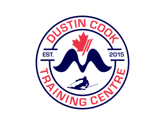
20 Responses to Option B
20 people chose B as their choice
3. It looks beautiful and bright
6. DC Training Centre to me makes it sound like the training center is in Washington DC. Dustin Cook Training Centre is more specific and makes it known through its logo that it's an alpine training centre.
12. It looks more sporty, athletic, and offical.
18. It pops out to me with the circle and the writing in red letters.
24. Option 2 will be more attractive.
28. somewhat attractive
29. I like that it had the name of the training center spelled out. I like the design of option 1 but honestly looking at it I dont know what DC isn't spelled out. I would think the name was DC, but it is just shortened and leads to confusion. Also, I like the design of the skier on Option 2, the skier symbol stands out more. Also, with option 2 it is neater and more compact all in a circle vs written out in a triangle design on option1.
31. because the looks being catchey
32. I like Option 2 because it looks much more professional and unique. The image of the skier, and the date the company was founded really stand out well in this logo and that makes it look great.
33. It looks more official and is more informational. The first option makes me think of Washington, DC not Dustin Cook.
34. Dustin Cook, known by his stage name "Macho Man" , is an American professional writer, director and producer. The Macho Man is recognizable by film fans for his distinctively deep and raspy voice, his flamboyant attire, directorial style, intensity exhibited on and off set, and his signature catch phrase, "Oooh yeah!" See full bio »
35. Option 2 is more elaborated than option A
36. I select option 2 because it has a little ski image which makes it easy to identify the logo with ski racing. Just looking at the logo, someone is able to know that the training centre specialize in ski racing.
39. i like
41. i like
42. Option two contains objects that are more vivid and appealing on the logo
44. It is more reasonable and appealing. It also carries meaning and with better presentation.
47. I prefer this because the logo looks more appealing and distinct. I also like the arrangement and design
49. Option 2 looks more official to me, even though I really like the first option as well. It looks like a badge that would be on the sleeve of a jacket, something to be worn with pride.
50. It is more appealing.
Demographics
Manage pending orders and track invoices.
Gender (Personal)
Age Range (Personal)
Share Your Results
Anyone with the following URL can see these poll results.